SUNY New Paltz competes for attention with other academic institutions in a world filled with marketing messages from a wide variety of businesses and organizations.
Reaching our audiences (which include prospective and current students, their families, alumni, faculty and staff, regional community members, government officials, the media, and other stakeholders) can be quite a challenge. In this highly competitive communication environment, how do we establish our place in the market?
Let us address that question by providing a deeper understanding of the University’s brand – the collection of visual and stylistic elements that helps SUNY New Paltz project a clear and consistent identity, with support from the entire campus community.
Successful brands are built on awareness, repetition, ingenuity and an emotional connection that inspire people to feel a certain way. A brand purposefully tells a story that people remember, with the promise of delivering a concrete set of values and benefits.
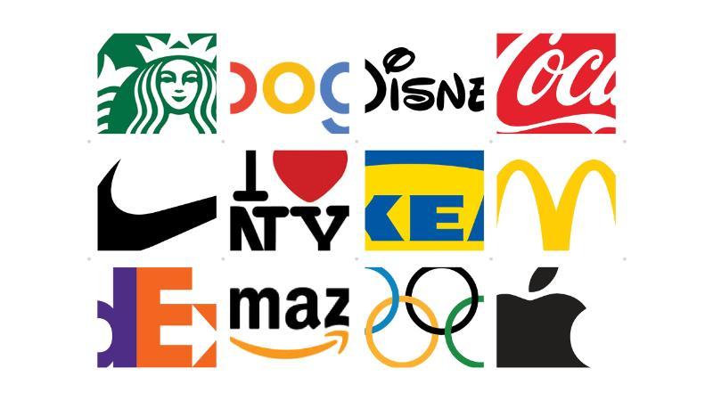
As you see in these examples, even glimpses of iconic brands are immediately recognizable. Companies seeking visual and emotional cohesiveness create a visual identity, such as a logo. These can communicate and amplify a branding strategy through physical and emotional cues.
An essential part of our brand is the official New Paltz logo: a mark consisting of an icon, typography and color.
The icon for the University can be evocative of many things – the nearby Shawangunk Ridge, the Atrium at the Student Union, or perhaps something more abstract, like an open door or an upward-pointing arrow. It has been designed to focus on our appealing location, our student-centeredness, the creative and forward moving environment in which our community members live and work.
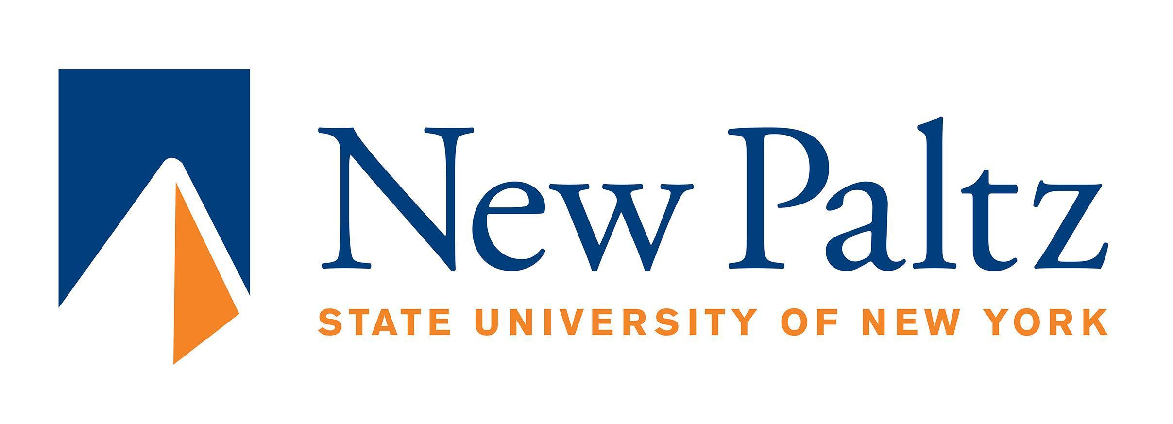
Official communications, including all visual pieces, must feature the SUNY New Paltz logo in accordance with our style guidelines.
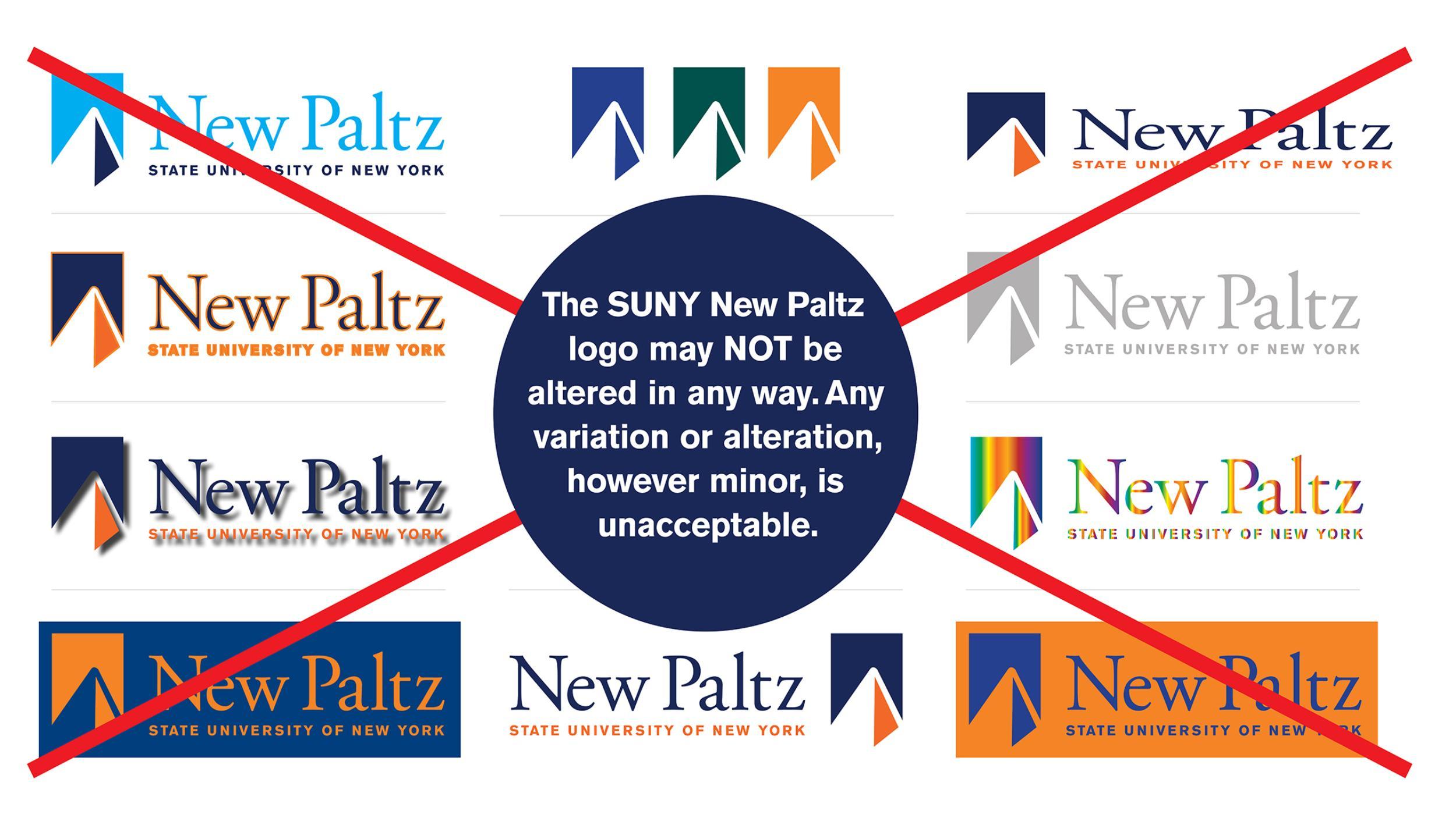
It takes work to preserve the integrity of our logo. When using our logo, please do not:
- Change the colors of any aspect of the logo (text, icon, background)
- Outline any part of the logo or apply any effects (drop shadow, 3-D, textures, glow, etc.)
- Distort or scale the logo disproportionately
- Fill the logo with a photograph or any other pattern or texture
- Turn, rotate or tilt the logo
- Use the icon alone as a logo (this may only be done in specific applications with the approval of Design Services)
- Use the type from the logo alone without the icon
Please refer to the University's Style Guide for a full outline of appropriate logo usage.
Our logo may be one of its most recognizable aspects, but the SUNY New Paltz brand is actually far more expansive than just that.
Our brand is supported visually and in other ways through our language, typefaces, colors, photography, videos, social media, and ancillary logos. These design components make up our institution’s “identity” system, which is outlined in our Style Guide.
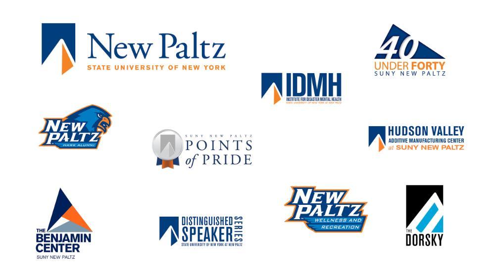
Design is expressed visually. From event flyers and posters to larger institutional campaigns, design concepts should adhere to campuswide style guidance on points like color, photography, font, text, logo position and layout.

Our design principles call for high-quality, dynamic, candid photographs to evoke the diverse academic, social, cultural and personal qualities of the University.
Some examples of how photography can go right, and how it can go wrong:

The image on the left shows a student and a faculty mentor working together toward a shared goal. The image on the right does not capture that collaboration, as the perspective is distant and the student’s body language is not engaged.

The image on the left shows action. The image on the right lacks motion. Dynamic photography is always more likely to attract attention.

The image on the left shows people making eye contact, connecting and conversing with one another. The image on the right shows a person’s back, which leaves the viewer outside the interaction.

Our campus serves an exceptionally diverse population, and our brand should aim at all times to represent our inclusive culture. Photographs that depict individuals of varied races, ethnicities, nationalities, genders, ages, sexual orientations and abilities are preferable to images that depict homogeneous subjects.
Another major obstacle to brand representation is low image resolution, which can result in fuzzy, unprofessional messaging.
High image resolution means more detail, and more detail means a sharper image and a clearer depiction of story and brand.
How do you know a photo is good enough to reproduce?
The Office of Communication & Marketing maintains an extensive library of images taken by on- and off-campus professionals. When you partner with us, you can feel confident that only photographs with the appropriate resolution for the output will be used.
A photo works well for digital design if it is 72 dots per inch (dpi) or higher. Designs for print should be 300 dpi or higher.

These two posters were created to support the University’s campaign for winter and summer session enrollment.

What elements can we observe in these pieces that effectively say “New Paltz”?
- The photos are clear, dynamic, high-quality and help tell the New Paltz story
- The logo is consistently placed in the lower right-hand corner
- The colors and typeface adhere to style guide
By combining these posters with several other pieces for print and the web, we build a design campaign that cohesively promotes these programs, connecting to one another in a way that makes them consistent and recognizable to the New Paltz community and external audiences.

As members of the SUNY New Paltz community, we are all brand ambassadors, and we all have a role to play. The successful expression of our institutional brand depends on a collective effort.
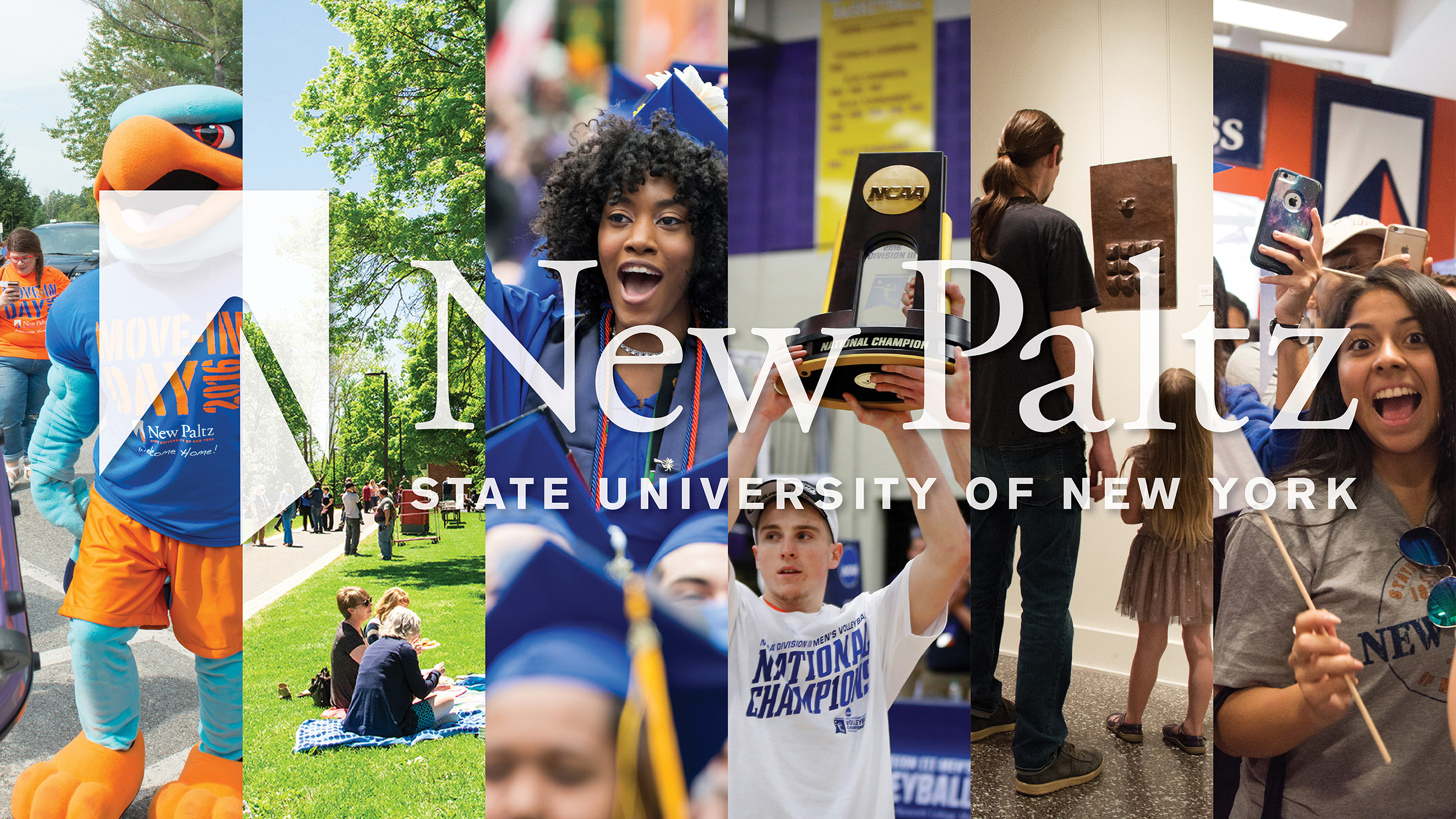
Why does this matter, and what does it have to do with you?
Working together to project a coherent brand identity can help University stakeholders meet a number of shared goals.
- Telling a cohesive SUNY New Paltz story
- Promoting clarity and recognition in campus communications
- Enhancing pride for students, alumni, faculty and staff
On the other hand, inconsistency in how we portray our institution and its programs can dilute our communication efforts and confuse our audiences.
Let’s look at a fictional example of visual communication that does not reflect the University’s brand well:

Here we see many of the design blunders that can confuse audiences and distort brand cohesiveness:
- Too many colors and fonts are used, and combine to produce a piece that is unattractive, distracting and difficult to read
- Images are of poor quality – they are low resolution, not licensed for use, and do not add meaningful information or insight to the overall message
- The copy is poorly written, features bad line breaks and a confusing hierarchy of information, and generally does not follow style standards
- The SUNY New Paltz logo is distorted, boxed in and improperly located
We cannot assume that all images on the Web are free to use. They may have copyright restrictions, so exercise due diligence when choosing imagery.
The SUNY New Paltz logo, athletic logos and various word marks (e.g., “NP Hawks”) are trademarked. Consult the Style Guide for a full list of these marks. Any use of these brand assets must be approved by the Office of Communication & Marketing and may be subject to licensing agreements.
If you have questions, please contact Laura Kniffen (kniffenl@newpaltz.edu), assistant director of design & brand services.

The Office of Communication & Marketing is happy to provide additional resources and materials to support your work as an ambassador of the University’s brand.
For further details, a copy of the Style Guide is available for download here.
If you still have questions, we’d love to have a conversation with you. Contact Design, Print & Mail Services to set up a consultation today:
Design, Print & Mail Services
Laura Kniffen
Assistant Director of Design & Brand Services
kniffenl@newpaltz.edu

